The Laurel Collection by Caesars Palace
As design lead at GSD&M, Our challenge was to set up a new elevated brand experience within Caesars Palace.
The Laurel Collection represents the most luxurious experience that can be had at this already iconic resort.
Amenities include a private valet entrance, the world renowned restaurant Guy Savoy, the luxurious Qua Spa, and an exclusive app which connects guests to the hotel’s services.
At the same time, this unique logo had to work seamlessly within the Caesars brand throughout the launch.
I did an exhaustive study leveraging the iconic laurels from the Caesars logo, the brand colors, while introducing a shield and monogram as a point of difference.
Here I want to show that no stone was left unturned while working within some pretty tight perimeters within the brand.
Our CEO at GSD&M was named Chairman of the Board at the Paramount and we were invited to pitch ideas for rebranding a new logo.
While none of these came to fruition, I was proud of the work that had been done and wanted to include them in my portfolio.
This first idea leverages the Iconic P over the marquis at the entrance. The stars represent the magical experience theaters offer, not only in the events, but the venue itself. The classical revival style built in 1915 is listed in the National Register of Historic Places.
As a venue for the performing arts, The Paramount has over a hundred years of history here in Austin. This logo is meant to reflect that enduring past, paying homage to the arts in a progressive and artistic fashion.
A more refined take on the historical venue is expressed in this direction.
And finally, a metal plate with a modern take for the logo embossed on metal. The idea being how this iconic venue is forged permanently into Austin’s culture for the Performing Arts.
While working for GSD&M, and ACD/Art Director for the Walgreens Account, this project came across my desk with urgency. We literally had a day to pitch ideas to Walgreens regarding a new endeavor.
Answers at Walgreens was a promotion set out to breakdown the barriers of the pharmacy counters around the country at Walgreens and create more interaction between Pharmacists and Customers. Interactions could occur in stores, in brochures, and online.
I leveraged the wayfinder icon used in the campaign: “At the Corner of Happy and Healthy” as a graphic connection, which nicely doubled as a conversation box.
Other solutions are connected to the brand by simply using the “W” from the logo.
When we pitched Lee at GSD&M, we offered a solution which urged consumers to “Test Drive” Lee jeans. Known for great fitting and comfortable jeans, I came up with a way to consolidate the logo and tagline into a button you might find on their jeans.
As mentioned earlier in the Design tab, here are variances of the logo presented to the client. This identity system was presented as a strategic answer to the idea that Caesars Palace offers unexpected variety in their already luxurious brand portfolio.
Established in 1866, the original building is a unique Austin landmark. The gorgeous stained glass of the facade was the main inspiration for the seal. Here we capitalized on their long legacy and leveraged it for the logo. Such a fun project.
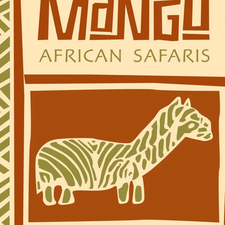
A colleague approached me 20 years ago with an idea to create her own African safari business. The next day, she brought in these amazing batik dyed textiles from Africa. I was immediately inspired and drawn to them. It stood for the authentic experience the company had to offer. Kudos to her and her partner for raising a very successful and award winning safari company, celebrating their 20 year anniversary. That kind of success just makes me smile.
A monogram and logo system designed for an online concept store focused on the well dressed modern college student.
Logo mark used to sign off in advertising. Shell Aviation has made a commitment to reduce CO2 emissions by 50% by 2050.
The logo by itself had to purposefully communicate the thought, care and freshness of flowers delivered though the internet.
Dominick is multi-faceted; a writer, a poet, a painter, a director, a photographer and a tennis dad.
I created a mark specifically to demonstrate how fluidly all of these talents can can come together to embody one creative soul.
One brush stroke, refined and fluid, playful and precise, form both the “D” and “W”. The mark is Inspired by Miles Davis’ trumpet. It is meant to demonstrate how Dominic approaches his work: with curiosity, harmony, but meandering fluidly.